

















A shopper can cross a store in less than a minute when the route offers no reason to pause. Straight sightlines, repeated fixtures and crowded messages may make the space easy to scan, but they can also reduce discovery. Encouraging people to slow down does not mean creating obstacles. It means giving them a sequence of useful reasons to look, turn, compare and engage.
A retail interior design agency may begin by studying the first few seconds after entry. Customers need enough space to adjust, understand the offer and choose a direction. Placing the strongest message directly against the doorway can waste it because people are still orienting themselves. A clearer arrival zone can reveal one inviting destination beyond it, drawing attention further into the store.
The route should then provide a changing rhythm. Long, uninterrupted aisles encourage faster movement, while gentle shifts in direction can reveal new product groups. This can be achieved through fixture angles, changes in floor treatment or carefully positioned focal points. The aim is not to create a maze. Customers should still understand where they are and how to reach key areas.
Product density affects pace as well. Too much stock can turn exploration into visual effort. Leaving breathing space around selected ranges helps customers recognise what matters and gives displays a stronger shape. Dense areas may still suit high-volume or value-led categories, but contrast is useful. A quieter display can signal a feature product, a new collection or a place where more consideration is expected.
Different heights create layers of discovery. Low fixtures preserve wider views and make the space feel open. Taller elements can define zones, support navigation or create a sense of enclosure around a specialist range. The balance depends on the store size and product type. Staff visibility, security and accessible reach should remain part of the decision.
Lighting can guide attention without adding another sign. Brighter focus on a table, wall or display can suggest where to pause, while even background light keeps the route comfortable. Glare, deep shadows and major colour shifts can make products harder to judge. A retail interior design agency should consider how lighting appears at customer eye level and how it changes across reflective, textured or dark materials.
Touchpoints invite a longer visit when they have a clear purpose. A sample bar, demonstration area, mirror, consultation table or comparison display gives the shopper something to do. These moments work best when the action is obvious and the space around them supports it. A tester hidden behind stock or a screen placed in a narrow aisle is unlikely to earn attention.
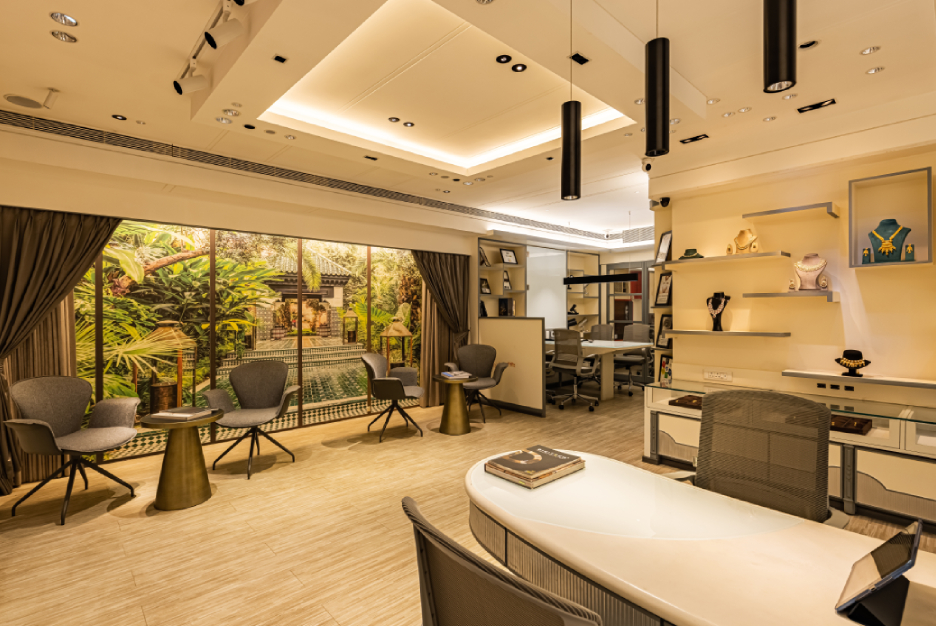
Seating needs similar care. In some stores, a well-positioned seat supports fitting, consultation or companions waiting nearby. In others, it can block circulation or become detached from the shopping experience. The useful question is not whether seating looks welcoming, but what behaviour it supports and how it relates to the surrounding products.
Staff activity also influences exploration. A retail interior design agency can check whether service positions support movement. Service points placed only at the front can leave deeper areas feeling unattended. Smaller points of contact, clear visibility and space for advice can make customers more comfortable about spending time. The design should support staff movement rather than rely on them to overcome awkward layouts.
The final test is observation. Movement paths, pause points and frequently missed displays can be reviewed after opening. Small changes to fixture angle, product grouping or messaging may improve the journey without a full redesign. When the design team treats pace as a series of customer choices, the store can encourage exploration while remaining clear, comfortable and easy to use.